Note: This is documentation for version 4.11 of Source. For a different version of Source, select the relevant space by using the Spaces menu in the toolbar above
Charts
Chart Tab
The Chart tab provides a graphical representation of selected result(s). This can be a single result (as shown in Figure 1) or multiple results combined into a single custom chart. Result(s) can be examined using alternative graph types, such as bar, histogram or cumulative. For charts containing two or more results, your chart can use more than one y-axis. All axes are displayed with their associated units.
In addition to the graph, the chart tab also contains:
- The chart toolbar (Figure 2), which allows you to customise the appearance of the charts, edit their properties, as well as save, copy and print charts, see Chart toolbar;
- An optional preview pane below the chart showing an overview of the entire chart and highlighting in grey the portion of the result that is displayed in the chart above, see Zoom and preview; and
- A Quick View toolbar that allows you to quickly alter the view of your results. You can apply either a date range filter or a repeating range filter, and you can also apply an aggregator, see Quick View toolbar.
Figure 1. Chart tab
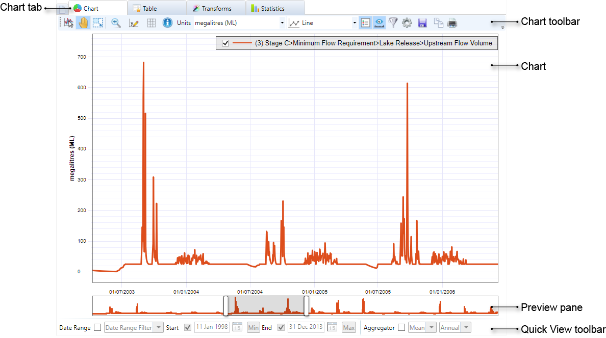
Chart toolbar
The chart toolbar (Figure 2) includes a range of options for customising the display of results within the active chart.
Figure 2. Chart toolbar
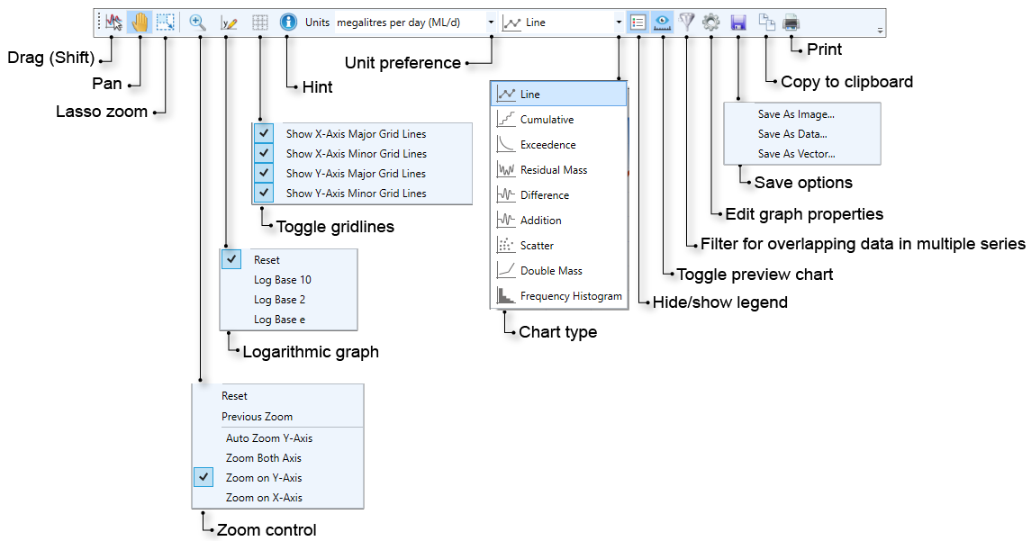
Note: Pan, lasso zoom and drag are mutually exclusive.
Drag
Allows you to drag the time series onto another chart. See Result tabs.
Pan
You can explore the chart by selecting this tool then clicking and dragging in the chart area. This is particularly useful when examining a particular area of a chart using the zoom function.
Zoom and preview
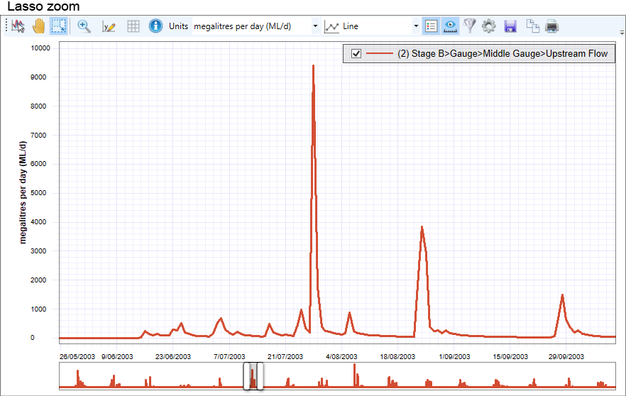
You can affect how zooming behaves using the Lasso Zoom button in conjunction with the Zoom Control pop-up menu. By default, you can zoom in and out using the mouse scroll wheel - scroll the wheel up to zoom in, and down to zoom out. Figure 3 shows a chart with no zoom and Figure 4 shows the same chart after Lasso Zoom has been applied.
The preview pane below the chart displays an overview of the entire chart, with the section of the result that is displayed in the chart above highlighted in grey and bordered by two handles. You can toggle the appearance of the preview pane using the Toggle Preview Chart button. When you zoom with Lasso zoom or the scroll mouse wheel, the highlighed section in the preview pane moves to reflect what is visible in the chart. The two handles in the pane can also be used to zoom - simply click and drag, left or right. You can also click in the centre of the greyed section to move the visible window to the left or the right.
Figure 3. Chart tab, No Zoom
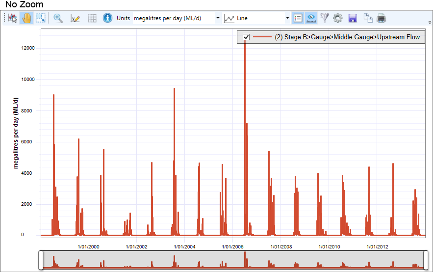
Figure 4. Chart tab, Lasso Zoom
The options available with Zoom Control include:
- Reset Zoom – Resets the zoom level of the chart to 100%. You can also double-click in the chart area to reset the zoom.
- Previous Zoom – Zooms to the previous zoom settings;
- Auto Zoom Y Axis – When zooming in or out, the Y-axis will automatically zoom to the maximum Y-axis value within the displayed X-axis values;
- Zoom Both Axis – Both the X and Y axes are zoomed in this mode. This is the default;
- Zoom on Y Axis – Only the Y-axis is zoomed, the X-axis remains constant. This can be also be achieved by clicking, then dragging up or down on the y-axis; and
- Zoom on X Axis – Only the X-axis is zoomed, the Y-axis remains constant. You also click and drag on the x-axis to achieve the same result.
Log Y-Axis
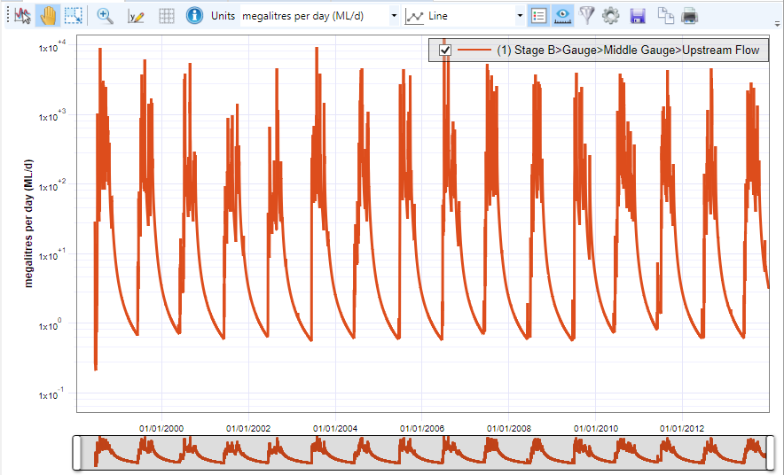
You can choose to display the Y-axis of the chart on a logarithmic scale by displaying the results in base 10, 2 or as a natural logarithm (base e). This can be useful where data ranges are wildly erratic or contain extreme spikes.
Use the Log Y-Axis drop down menu for this. The chart shown in Figure 5 is a logarithmic representation of the chart in Figure 3 (notice the logarithmic scale on the y-axis).
Figure 5. Chart tab, log base 10 y-axis
Gridlines
You can view or hide the grid lines on the chart using Toggle Gridlines. This pop-up menu allows you to view the major and minor grid lines on both axes. You can create various combinations using the four options in the pop up menu (eg. Figure 6 shows major and minor gridlines on both axes). The spacing of major and minor gridlines is configured in the Chart Settings dialog, see Chart axes.
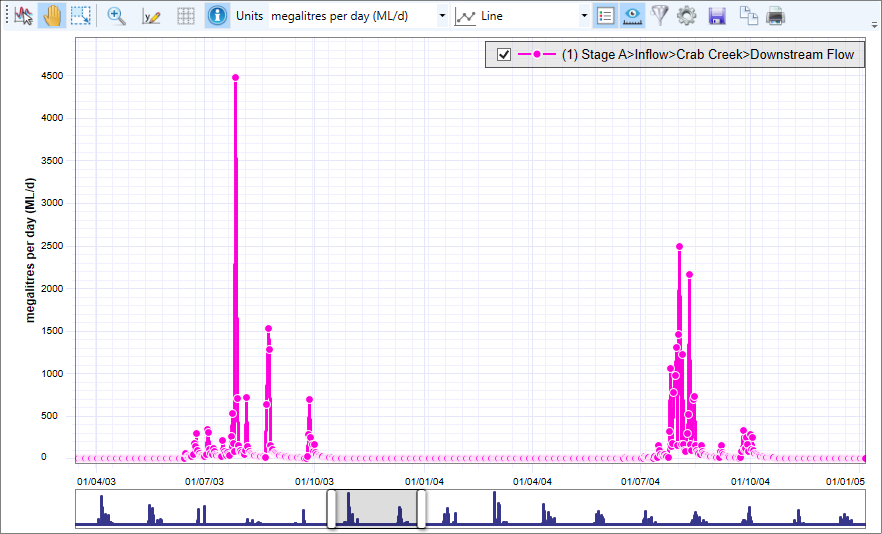
Tracing points and the Hint icon
Tracing points are the set of data points that form a chart. When the Hint button is enabled, hovering over the chart displays a tooltip of the X and Y values at these tracing points. Disable the button again to hide these values.
To display tracing points, simply click on a series in the chart to select it (Figure 6).
Figure 6. Tracing points
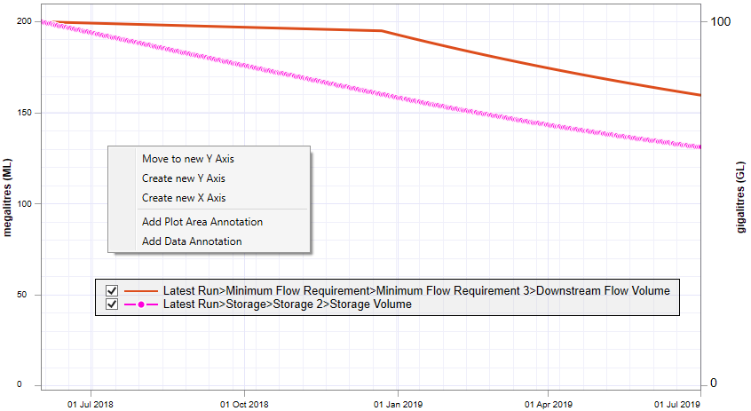
If you display tracing points and then right click in the chart area, a contextual menu (Figure 7) allows you to modify the appearance of the selected series.
- The first two items create an additional Y-axis or chart area, and moves the selected result to that axis or chart area respectively; and
- The remaining items allow annotations to be added to the chart area.
Figure 7. Tracingpoints, special contextual menu
Units
To change the units on the y-axis, make the appropriate selection from the Units drop down menu. The units shown are those available commensurate with the result/s selected.
Chart type
Use the Chart Type drop down menu to choose the type of chart to display. See Graph Types for details.
Legend
By default the legend is shown at the top right of the chart area and allows you to choose which results are shown by using the tick boxes beside each series. Toggle the view of the legend with either Hide/show legend in the Chart toolbar, or the chart contextual menu. This is useful when a custom chart contains several results, and the list of results in the legend takes up a considerable amount of space. You can change the position of the legend by clicking with your mouse and dragging, or through Chart area settings, this can make it easier to view your results.Additionally, you can rename the legend using the Series Settings dialog (Figure 16). Once renamed, the original series name appears as a tooltip when you hover over the legend. Renaming a series does not change the name of the result in the tree.
Toggle Preview Chart
Toggles the view of the preview pane below the chart area.
Filter for overlapping data in multiple series
For a custom chart with multiple results, toggle on to hide all data on dates where one or more result has missing values. When toggled off, the data for the other results is still plotted for that date. This button is automatically turned on and disabled for the following chart types:
- Double mass
- Exceedance
- Scatter plot
Edit Graph Properties
Opens the chart settings dialog, see below.
Save, copy and print
You can save, copy and print charts using the last three items in the Chart toolbar, respectively. These allow you to:
- Savethe chart as an image (*.png file), as a data file (*.res.csv format), or as a full vector graphic (*.xps format);
- Copy the chart to the clipboard as an *.emf file, which is a full vector format that can then be pasted directly into Word; and
- Print the chart.
Quick View toolbar
Located at the bottom of the chart (Figure 1), the Quick View toolbar (Figure 8) allows you to quickly alter the view of your results. You can apply either a date range filter or a repeating range filter, and you can also apply an aggregator (see Transforms - Types of Transforms for descriptions). These affect the chart, table and statistics view of your results. Unlike transforms, if you re-run your model, or save, close and re-open your project, your selections in the Quick View toolbar will not be saved.
Figure 8, Quick View toolbar
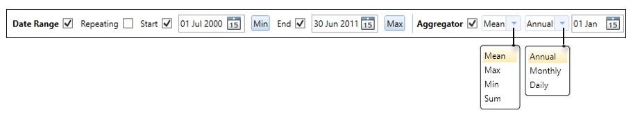
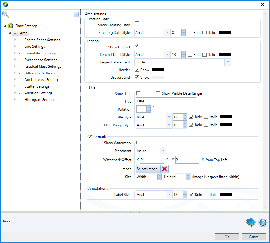
Chart settings
The Chart Settings dialog (Figure 9) allows you to centrally manage the display settings of charts and their components. It can be accessed via the Edit Graph Properties button on the toolbar.
The dialog contains two panes: a tree menu on the left and a properties pane on the right. The former allows you to select the group of settings which you wish to edit, Figure 9 shows the "Area Settings" selected where the user can edit the characteristics of the features of the chart area, options for how specific features are shown: creation date, legend, chart title, chart watermark and annotations.
Each chart can be plotted in 9 different formats (Line, Cumulative, Exceedence, ...) the settings for each of these formats can be edited individually, or collectively (using "Shared Series Settings") by selecting the rows beneath "Area" in the tree menu on the left (Figure 9).
Figure 9. Chart settings: Area Settings
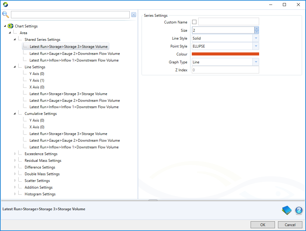
In the "Shared Series Settings" options, each time series plotted in the chart is listed in the pane on the right and can be re-ordered as required by the user (Figure 10). Under "Shared Series Settings" the user can edit the properties of each time series plotted in the chart (Figure 11) which will be used as common properties in all 9 chart formats (if common properties are selected).
Figure 10. Chart Settings: Shared Series Settings.
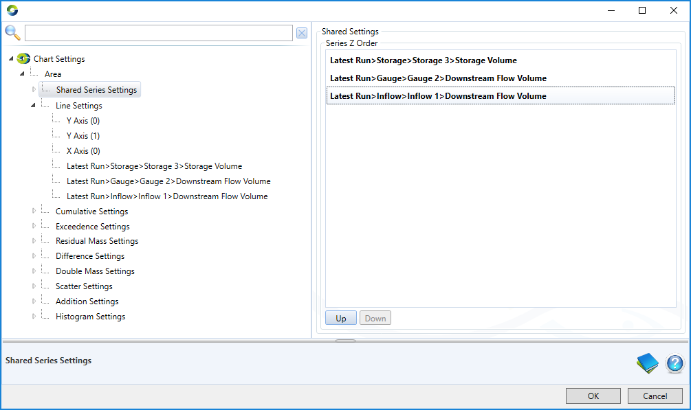
Figure 11. Chart Settings: Shared/common series settings for a time series.
Under each chart format option (line, cumulative, ...) the user can edit time series formats individually for this chart alone, but also has the option to 'use common series settings' by ticking a box (see box in Figure 12) this option uses the settings under "shared series settings". The order in which the series are plotted can also be edited (Figure 12).
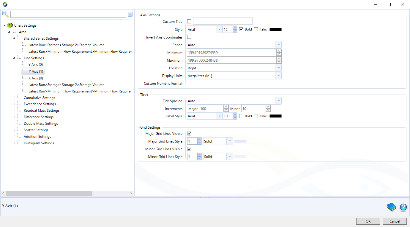
At the individual chart settings level (line, cumulative, ...) the properties of the axes can be edited (Figure 13) and additional axes can be added by right-clicking on "line" or other chart setting. Figure 13 shows how a user might do the following:
- Add and remove secondary axes;
- Edit an axis' title, colour and location;
- Change tick spacing and style, adjusting the major and minor increments affects spacing of major and minor gridlines; and
- Toggle visibility of gridlines and change their style.
Figure 12. Chart Settings: Settings for Line chart
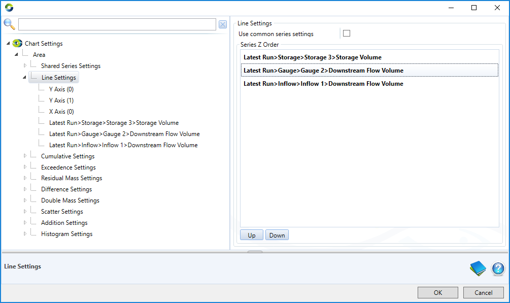
Figure 13. Chart Settings: Settings for Axes
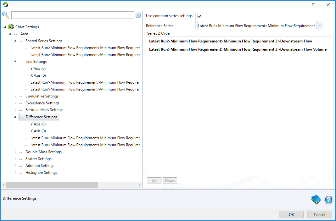
For the difference, double mass, scatter and addition charts, the reference series is selected in the chart settings window (Figure 14).
Figure 14. Chart Settings: Settings for Line chart
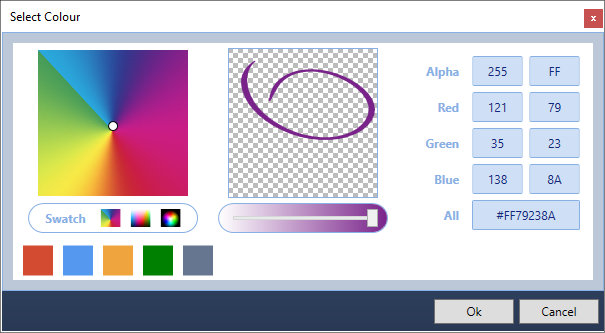
Colour
In chart settings and in other areas of Results Manager where you are able to modify colour, this is done by clicking on the relevant colour bar. This will bring up the dialog shown in Figure 15. You can alter colour by selecting it from the colour palette on the left-hand side. Underneath the colour palette are alternative colour palette swatches, and below that are the default colours. The selected colour is displayed in the centre. You can change the transparency of the colour using the slider. Alternatively you can enter the colour's RGB or HEX code along with the transparency (alpha) on the right.
Figure 15, Colour choice dialog window