Note: This is documentation for version 4.11 of Source. For a different version of Source, select the relevant space by using the Spaces menu in the toolbar above
Recording Manager
Each scenario run creates a distinct result set. Each result set is represented by a tab in the Recording Manager. The name of each tab is formed by concatenating the name of the scenario with a time-stamp indicating when the scenario was run. For example, Figure 1 shows that "Scenario 1" has been run twice at different times.
Figure 1. Recording Manager
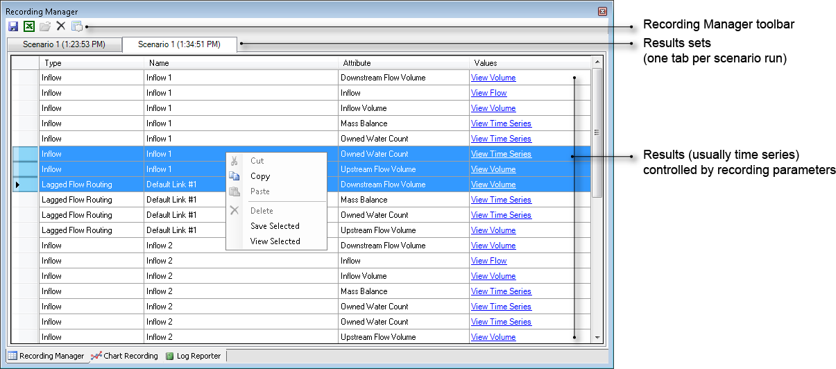
You can use the tools on the Recording Manager toolbar to save a result set to a file, export results to Microsoft Excel, or delete the currently-selected result.
Within each of the Recording Manager’s tabs, results are arranged in four columns:
- Type - Source generic name for node or link (eg Inflow);
- Name - your name for that component;
- Attribute - the name of the output parameter as listed in Parameters (eg. Additional Inflow); and
- Values - a link which can be clicked to view a graphical representation of the output parameter.
You can navigate through a list of results using the vertical scroll bar. In addition, clicking on a link or node in the Schematic Editor, Geographic Editor or Project Hierarchy automatically selects all of the results associated with that component in the Recording Manager.
Right clicking in the Recording Manager, then choosing Save Selected allows you to export the selected time series data as a .csv file. Choosing View Selected opens the Charting Tool for the selected time series data.
One of the key uses of the Recording Manager is to select one or more results (rows in the Recording Manager) for display in the Charting Tool. The Charting Tool helps you visualise, analyse and understand scenario results and other data produced by Source. Each time you click a link in the Values column, a copy of the Charting Tool opens to display that result. Clicking the same link multiple times opens additional copies of the Charting Tool containing the same result.
Recorder Results
The Recorder Results window (Figure 2) is a special case of the Charting Tool. At present, it is only available for the Continuous Sharing Recorder recordable attribute of the Resource Assessment tool but this functionality is likely to be extended to other result sets.
Figure 2. Recorder Results window (Graphing tab)
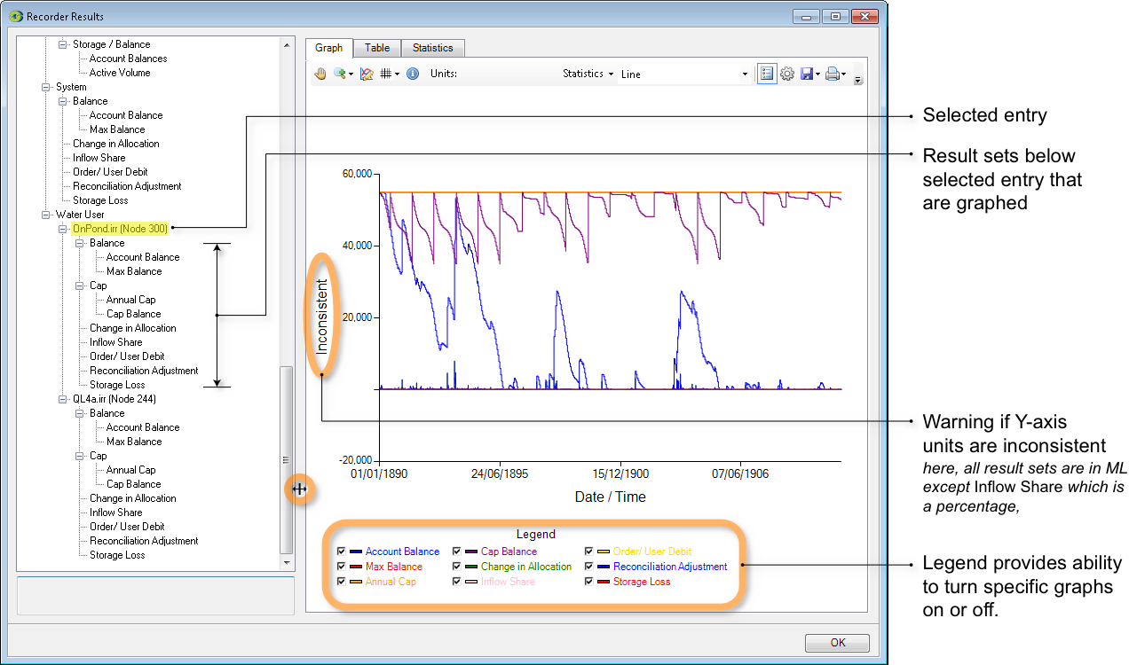
In effect, the Recorder Results window pre-assembles related result sets and arranges them in an hierarchical display. The hierarchy contains two kinds of entry:
- structural elements are associated with a + or - symbol; and
- results are not associated with a + or - symbol.
You can perform the following actions within the hierarchy:
- Clicking a + or - symbol expands or contracts the hierarchy;
- Selecting a result graphs the associated result. You can use both control-click and shift-click to extend the selection to graph multiple results; and
- Selecting a structural element causes all entries below it in the hierarchy to become selected. All results contained in the implicit selection are graphed.
Although the collections of result sets displayed in the Recorder Results window are related, this does not necessarily mean that all result sets employ the same units. When a selection of results contains inconsistent units, the label for the axis will change to "Inconsistent". This situation is shown in Figure 2. This is because eight out of the nine selected results are expressed in megalitres whereas the Inflow Share result is expressed as a percentage.
Each graphed result is also represented in the legend. Each entry in the legend is associated with a checkbox which can be used to show or hide individual graphs. Changing the state of a checkbox will either:
- Trigger a check for inconsistent units. For example, turning off Inflow Share in Figure 2 would result in the Y-axis label changing to "ML". Turning the graph on again would return the Y-axis to "Inconsistent"; or
- May cause the graph axes to be re-scaled. For example, turning off all graphs except Reconciliation Adjustment (the blue trace that hovers near Y=0) would result in MaxY=8000 megalitres rather than the 60,000 megalitres shown in Figure 2.
You can adjust the relative proportions of the window that are devoted to the hierarchical display and the tabbed area by dragging the divider.
Aside from the differences explained in this section, the behaviour of the Chart, Table and Statistics tabs is identical to that of the like-named tabs in the Charting Tool.