Note: This is documentation for version 4.11 of Source. For a different version of Source, select the relevant space by using the Spaces menu in the toolbar above
Graph Types
Line
This is the default chart type in Source. Selecting a result in the tree menu on the left side of the Result Manager window will display a line graph (see Figure 1).
The contextual menu (Figure 1, Figure 2) can be used to do the following.
- Move to new Y Axis. If you highlight a result, then this option is active to allow you to move this result to a new Y Axis.
- Create new Y Axis. If you select this, a new Y Axis is added to the right side of the chart.
- Create new X Axis. If you select this, a new X Axis is added to the bottom the chart.
- Add Plot Data Annotation adds a note to your chart that stays static when you zoom or pan.
- Add Data Annotation adds a note to your chart that moves when you zoom or pan.
- To create a new note, choose Add Plot Data Annotation / Add Data Annotation. This creates a note called New Plot Data annotation /New Data Annotation .
- Double click on the note to edit the text. The font size, style and colour of the note can be changed in Chart area settings; and
- To remove an annotation, click on the annotation, right click, then choose Delete Selected.
Figure 1. Line graph
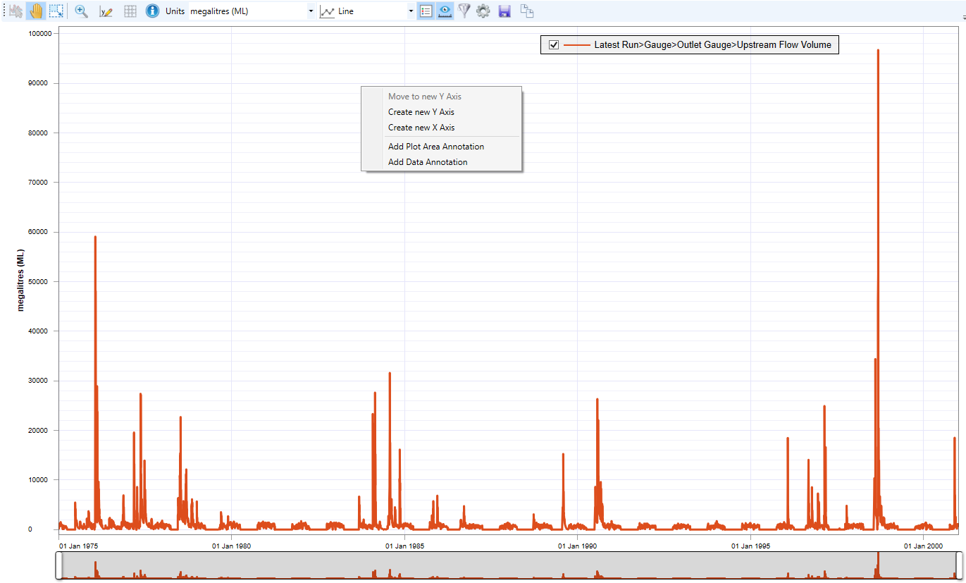
Figure 2. Contextual Menu for chart with multiple series
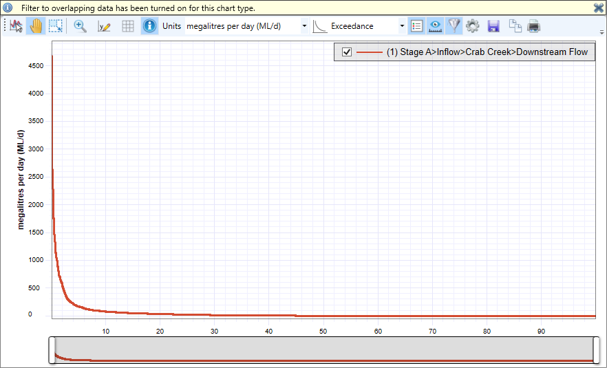
Exceedance
An exceedance graph keeps the y-axis constant relative to a line chart, but calculates the probability of exceeding Y-axis values on the X-axis (Figure 3). The contextual menu is the same as that for a line graph.
Figure 3. Exceedance graph
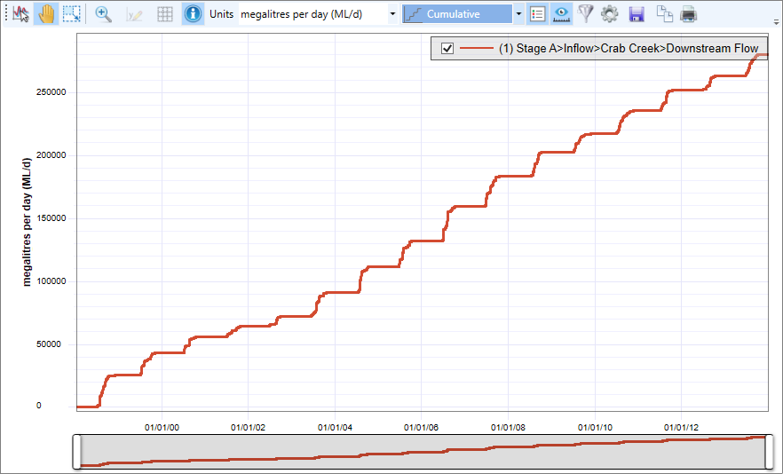
Cumulative
A cumulative graph displays the cumulative total (on the y-axis) over time (Figure 4). The contextual menu is the same as that of the line graph.
Figure 4. Cumulative graph
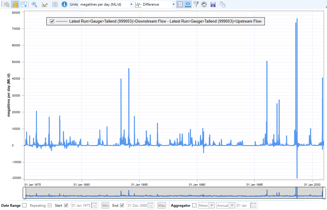
Difference
The x-axis remains unchanged relative to a line chart, and y = 0 represents the baseline (Figure 5). Differences between each overlaid result and the reference series are plotted. By default, the result loaded into the custom chart first will be used as the reference series. To change this, go to Chart Settings » Difference Settings and modify Reference Series. The contextual menu is the same as that of a line chart with multiple series. See also Naming conventions of difference, double mass and scatter statistics.
Figure 5. Difference graph
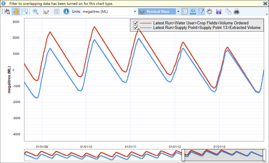
Residual mass
This graph is a plot of the cumulative deviations from the mean of a time series (Figure 6). To calculate the residual mass, subtract the mean of the time series from each value (to get residuals) and cumulate. It ignores nulls when calculating the mean. For multiple series, data across all series is ignored on dates when there is a null in any series. The contextual menu is the same as that of a line graph.
Figure 6. Residual mass graph
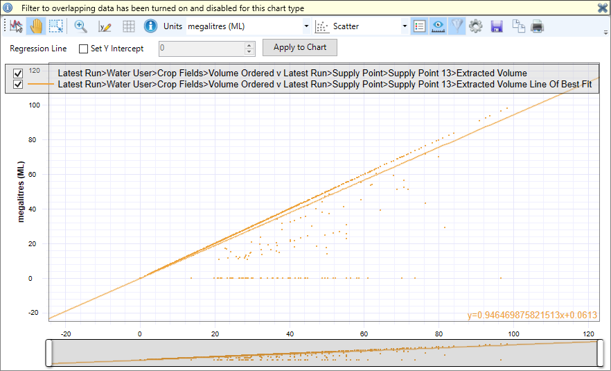
Scatter
In this graph type, the y-values from two time series are grouped into pairs based on common x-values (times) in the original results (Figure 7). Then these pairs are plotted as (x, y) coordinates; the y-values from the reference series are plotted on the x-axis. By default, the result loaded into the custom chart first will be used as the reference series. To change this, go to Chart Settings » Charts and modify Chart Type Reference Series. The contextual menu is the same as that of a line graph with multiple series and so includes the Delete Series option allowing you to delete a series used in the graph. See also Naming conventions of difference, double mass and scatter statistics.
A scatter graph:
- Shows the correlation between two results;
- The equation at the bottom right is the regression line; and
Setting the y-Intercept to 0 forces the line through the graph's origin.
Figure 7. Scatter plot
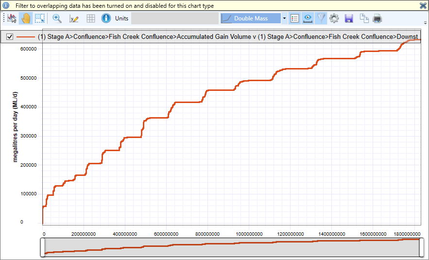
Double mass
This is a scatter plot comparing the cumulative totals for two results, this can be useful for comparing a number of rainfall stations (Figure 6).. For each result, the cumulative total of y-values is calculated over time. Then, the y-values from the two results are grouped into pairs based on common x-values (times) in the original results, and these pairs are plotted as (x, y) coordinates; the cumulative y-values from the reference series are plotted on the x-axis. By default, the result loaded into the custom chart first will be used as the reference series. To change this, go to Chart Settings » Charts and modify Chart Type Reference Series. The contextual menu is the same as that of a line graph with multiple series and so includes the Delete Series option allowing you to delete a series used in the graph. See also Naming conventions of difference, double mass and scatter statistics.
Figure 6. Double mass graph
Frequency histogram
A frequency histogram shows how the data values are distributed. Set the number of bins your data is divided into using Histogram Interval and select Apply to Chart. Note that entering small values for large data sets will increase computational time. The contextual menu is similar to that of a line graph with an additional item - Label Y Values displays the y-value of each bar (enabled in Figure 8).
Figure 8. Frequency histogram

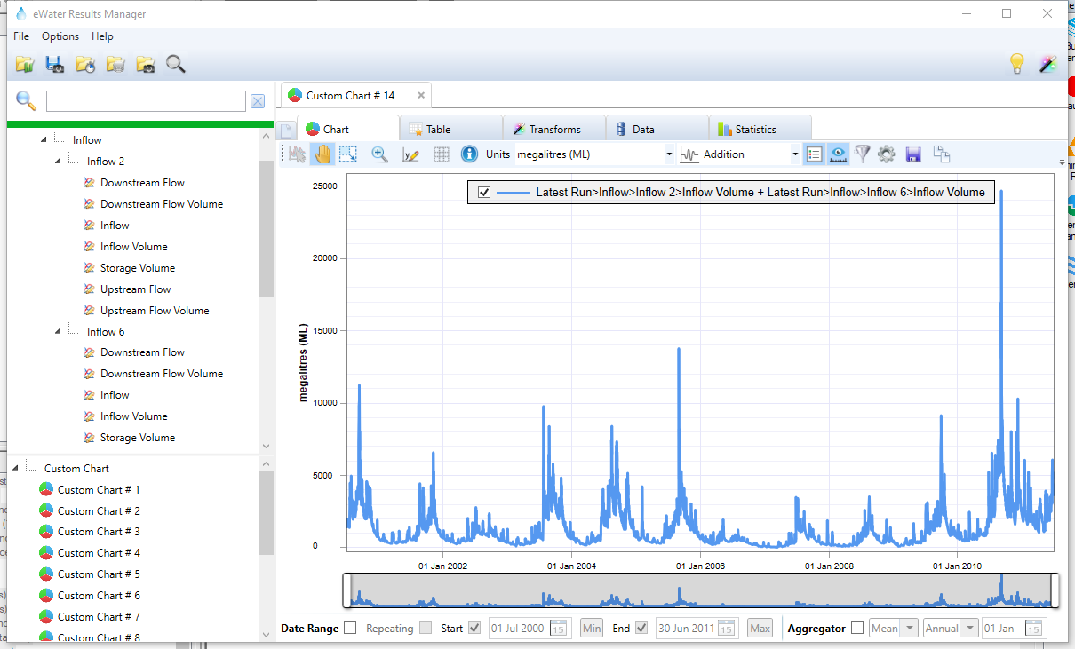
Addition
This type of graph displays sum of two results.
Figure 9. Addition graph